Polski
FAQ
1. I’m having technical issues loading and displaying the page.
The Smart Supplement Monitor report should display correctly in all popular web browsers (Chrome, Firefox, Edge, Safari, Opera). The report does not have a dedicated mobile version. A stable internet connection is required for proper operation. In case of any technical problems with the use, we suggest the following steps:
- Refresh the page bypassing the cache (Shift + F5).
- Check your internet connection. Make sure you have a stable internet connection as network issues can affect the correct display of the page.
- Clear the cache. Sometimes the data in the browser’s cache may be damaged or outdated. Clear the cache in your browser settings.
- Check memory usage in the Task Manager. Page objects are generated using your device’s RAM (the Qlik engine works on the in-memory base). Too little RAM can result in slower loading times and the reduced responsiveness of objects.
- Temporarily disable any browser add-ons or extensions to see if they are causing the problem.
- Check with a different browser. If a page does not work properly in one browser, check it with another browser to make sure that the problem is not with a specific program.
- Reset your browser. If none of the aforementioned methods work, you can try resetting your browser settings to default.
- If none of the aforementioned suggestions have resolved the problem, please contact us.
2. I can't see all the objects or the objects are cut off.
3. What range of data is displayed on the sheet?
4. How can I filter the data?
We filter the data using filtering objects placed on the side panel, which is expanded using Filter button [Filters] located in the left part of the navigation bar. Select the field of interest and click on it.
After expanding the selected filter, we can select the field values associated with the data which we want to see in the Monitor. To confirm the selection, click on the button “confirm”. The selected filters are deposited in the current selections bar at the top of the screen. Once applied, filters will be active for all Monitor sheets until they are removed.
5. How to modify an applied filter?
6. How to remove the applied filter and undo the status of the filters?
Filters are applied to each field separately. To remove a filter from a given field, find it on the filter bar at the top of the screen and press the cross to the right of the filter.
![]()
To remove all filters or to move between the historical states of the filter bar, you can use the context menu on the left side of the selection bar:
![]()
7. Why do the elements in the filters have different colours?
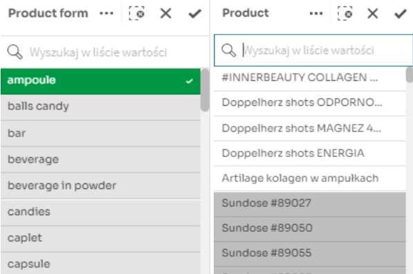
This is due to the associative nature of the visualization engine. After applying the filter to one field, the engine narrows down the information only to the data related to the selection, e.g. if we filter ‘ampoule’ in the Product form filter, then in the Product filter, we will see marked products registered only with this Product form in white, while the rest of the products will be greyed out.
So we have three possible filter colours:
- green – the choice which we have made,
- light grey – the colour which appears on the filter which we are already using; it indicates dimension values which can be selected for analysis without disturbing existing associations in the model,
- dark grey – these field values are not related to the current selection (e.g. the Sundose #89027 product was not registered in form of ampoules);
- IMPORTANT NOTE: selecting such a field will remove colliding filters.
8. Why do some filters sometimes disappear when filtering?
This is because you have selected a dark grey box in the filter. See: Why are the elements in the filters in different colours?
9. Are there alternative ways to apply filters?
Yes, in addition to using filters from sheets and the filter bar, we can apply filters directly on visualizations. If somewhere on the chart we see a dimension which we are interested in, just click on the visualization fragment(s) or label(s) which represents it, and then confirm the selection ![]() .
.
In this way, we can select more than one dimension value at the same time (e.g. three different products).
10. How to change dimensions in visualizations?
Selecting the Total option displays one cumulative category for the entire dataset in the visualization.
11. Is there an option to export data in a tabular form?
After pressing it, the table with the data used to create the visualization will be automatically downloaded to a file in the xlsx format.
12. How to display an object in the full screen mode?
13. How to use a visualization from the GIS Monitor in your own presentation?
The Smart Supplement Monitor tool does not have a built-in export to image files (.jpg, .png, etc.).
The best solution is to use ready-made solutions of operating systems to cut out fragments of the screen (for Windows: Windows logo+Shift+S, for Mac: Shift+Cmd+4).
We will achieve additional scaling possibilities by calling the object in the full-screen mode and changing the zoom in the browser.
14. How to display an object in full screen mode?
When you hover over an object with the cursor, a full screen button will appear in the upper left corner.
When clicked, it will display the visualization in full screen mode.
To exit the full screen mode, press the full screen mode button, the ‘X’ button at the top of the screen or the escape (Esc) key.
15. What is the "Products with an ingredient" filter used for?
The “Products with ingredient” filter is used to directly filter all products containing a given ingredient.
This approach differs from filtering an ingredient in the “Ingredient” filter because it does not limit the composition of products to the selected ingredient.
This difference can be seen particularly clearly in the “Composition analysis” sheet.
16. Can I download the raw data from the app?
17. What is the “Advanced Composition Analysis” view used for, and how do one use it?
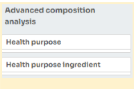
The “Advanced Composition Analysis” view contains data generated through the clustering of products based on the similarity of their compositions. Clustering is performed for products with selected ingredients that have been confirmed by research to have specific effects. In the case of products of a supplementary nature, we are talking about a specific health purpose, as indications are only mentioned in the case of medications. To use this view correctly, you should choose one ingredient for analysis using the filters in the “Advanced Composition Analysis” section on the filtering panel.
The view allows for the analysis of ingredient similarities through cluster analysis. Products with similar compositions are grouped into clusters. The set of ingredients that appear in every product within a cluster (the common part of the composition of all products) is referred to as the cluster’s core and is marked in green on the treemap plot. Ingredients that are not part of the cluster’s core are indicated in blue.
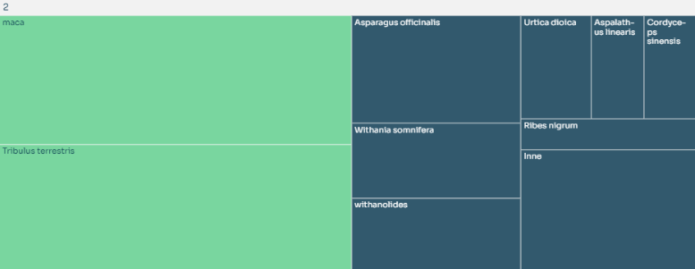
Clusters are numbered based on their size, with the most numerous cluster having an ID of 1. Each cluster has its distinct core, and a single product can only belong to one cluster. This way, we group products with similar compositions into separate groups, and analyzing these groups helps us understand the patterns of ingredients used by manufacturers when introducing products. The view allows us to detect the most common types of compositions and the frequency of adding specific ingredients to product compositions.
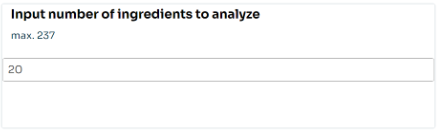
For some ingredients, there may be dozens of clusters and hundreds of unique products. In such situations, analyzing the entire dataset at once can be challenging. To address this, we have introduced two windows where users can specify the number of the top n clusters (in terms of size) and the number of the top m ingredients (in terms of frequency of occurrence in compositions). This way, we analyze only the most significant clusters and ingredients. If you need a more detailed analysis of a cluster, you can always filter it by its ID by selecting it in any visualization.